Looking Up I See Only a Ceiling review

- 0 Comments
Short, single-location psychological thriller offers intrigue but with space left to grow
Do you ever get the feeling that something is sneaking up on you? Not someone, like a hockey mask-wearing killer or carnivorous alien, but a thing, an event, or a deadline. I still have a recurring nightmare that I’m in my high school gymnasium about to write the math final that I have not studied for. Looking Up I See Only a Ceiling attempts to capture that very sense of impending doom. It’s a short game – about the length of one of my math test dreams – but it’s well designed, both in terms of art and gameplay. It's hard to call it a fully developed experience; nevertheless, the game communicates a tangible and relatable sort of stress-nightmare scenario in a way that makes it, believe it or not, kind of fun.
Looking Up has players assume the role of a (nameless) medical student studying for her own exams. It begins with her waking up from an unnerving dream of a man staring down at her. As you explore the protagonist’s house, seeing it through her eyes in first-person perspective, her reclusive and stressed state of mind becomes evident not only through her internal monologue but in what you see. Medical textbooks are haphazardly scattered across her computer desk, highlighting the sheer volume of material she is trying to comprehend, as well as her struggles in doing so. In the bedroom as you look out the window, she’ll comment on children playing at the nearby playground. The children are represented as unsettling dark silhouettes, however, creating a subtle sense of unease. Later on, the line between hallucination and reality begins to blur, with extreme occurrences like flooding, sinkholes, and hidden rooms in the home prompting you to question how reliable a narrator the protagonist is.
The second main room you visit is the kitchen, which acts as a sort of tutorial, prompting you to prepare breakfast in a certain order. Picking up items in an order the protagonist does not utilize in her routine will result in you having to start the sequence over again, giving you a hint as to how the game is to be played in more consequential scenarios. The logic is mostly sound, and there was only one minor instance where I thought I should have been able to use an object to solve a puzzle when the game wouldn't let me. Nevertheless, considering its overall brevity (and the puzzle’s actual solution) it’s hardly worth criticizing. That said, this instance is really the only one that could be called a proper puzzle in the entire game, with most other objectives boiling down to finding and picking up items for use in a certain linear order, often nearby where they are found.
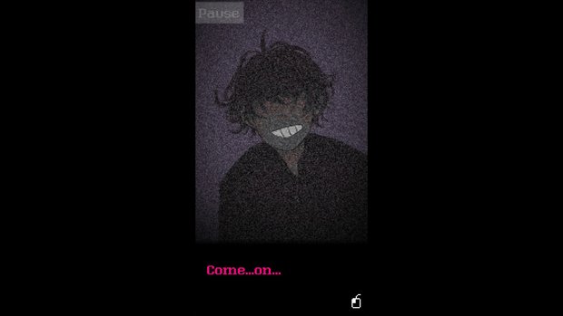
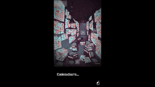
The mysterious young man from the opening dream begins making frequent appearances after the kitchen sequence, giving the protagonist only vague replies when she demands to know how he got into her home. He seemingly jumps in and out of existence, appearing and disappearing after feeding her cryptic information about the disorienting state of her home. Calendars begin showing up on her walls and floor with circles and Xs written in thick red marker, connoting some sort of impending countdown. Scenarios become more and more radical and surreal as you proceed, as does this man’s role. It never results in a jump out of your seat moment, but Looking Up does effectively convey a foreboding kind of suspense over its brief runtime.
While there isn’t a clearly defined goal overall, it’s evident from the mess on the protagonist's desk that there is work to be done and she is putting it off. However, the quest isn’t so much to make her focus on her studies as it is to share the ride of her procrastination and avoidance as she is led on a wild goose chase to escape the strange labyrinth her house seems to be mutating into. The ending is satisfying, if predictable, but it’s nevertheless fun to accompany the protagonist through her struggle, anxiously hoping to see her land on her feet and find direction once again.
Rather than navigate freely, you explore the house via predetermined, single-image slideshow-style nodes, clicking on highlighted interaction points. You can only explore at the protagonist’s direction, with certain routes blocked off until she decides she needs to go there. Her monologue is near constant, and because there are so few hotspots and the available spaces are small, getting lost is never really an issue. Not every point of interaction or item needs to be interacted with in order to move on, though some are required to get the game’s “good” ending. I managed to get that one on my first try, though a single playthrough is only 20 minutes long, so replaying afterwards for another ending is no big commitment.
Getting the “good” or “bad” ending comes down to how you solve the final sequence, though there is also a “secret” ending should you really want to see everything, though it essentially just cuts the game short and adds nothing to the main storyline. Progress is automatically saved at fixed checkpoints, though you’ll probably play through it in a single sitting anyway. However, upon completing the game you can choose to start from any previous checkpoint, and the game highlights where the branching path for the two main endings lies, making it easy to jump back in and try something else if you don’t wish to play the entire game again.
Individual screens have no animation in them, though a television static filter overtop does create an atmospheric aura. The art is all hand-drawn, and the colour palette is a muted spread of greys and pinks, giving the game a nice two-tone comic book look. Rather than filling the whole screen, the current game scene is a vertically oriented section of the middle, with black borders all around it. Keeping the images small works well for the claustrophobic setting, and almost makes it feel like travelling between frames in a manga. Room design typically adheres to one- or two-point perspective, and the architecture is drafted with straight lines most of the time, though some incorporate warped or curved lines to exaggerate distance or distort reality in a comic book-esque fashion. Character models look great, and there is a bit of simulated movement in some sequences, like when the protagonist picks up an object, it will appear on-screen in her hand.
There is no voice acting, as all dialogue is presented as text in the bottom part of the viewable area. The low humming ambient soundtrack in the background keeps the mood grim, with sound effects reserved for instances like reaching a checkpoint, as well as some environmental cues when interacting with objects. You can adjust the levels of music and sound effects in the menu, and can play the game full-screen or windowed, but these are the only customizable options.
Once you complete the game, you are awarded with an "Explore Mode" that allows you to roam the entire house after the events of the game. Without giving any spoilers, the composition of the house changes slightly here. There is no present danger, nor a set of tasks to be completed, but the protagonist will state new things when interacting with objects and points of interest, acting as a nice epilogue, even if some of the exposition is a bit heavy-handed. There is no new ending in this mode (that I could find); it’s just a bonus to wander around in until you feel you’ve had enough. There are also a few Easter eggs to find in this mode, and I found it an enjoyable way to spend ten or so extra minutes. The ending you receive does not appear to have an effect on Explore Mode, so it can serve as a coda regardless of the outcome you get in the game proper.
Final Verdict
Looking Up I See Only a Ceiling is a memorable experience thanks to its strong art design, ominous atmosphere and a handful of well-conveyed obstacles. However, it’s hard to call the game a must play, as it feels a bit too short for the message it is attempting to convey. I am looking forward to seeing what indie developer silver978 tries next with a bigger scale and more ambitious design, as they certainly have a firm grip on how to create a claustrophobic adventure. I wish this modest debut had tapped deeper into its themes of distraction, stress, and procrastination, but even as it stands, the game is an enjoyable micro-horror experience while it lasts.
Hot take
Looking Up I See Only a Ceiling is an extremely short but nightmarishly eerie micro-experience. Its manga stylings and sensible puzzle design make it enjoyable to play, though even with its post-game replay options, it feels like a ton of potential for expansion was simply left unexplored.
Pros
- Helpful tutorial segment introduces gameplay mechanics
- Nice hand-drawn art design, with a foreboding ambient soundtrack and muted colour palette adding to the dreary and mysterious setting
- Explore Mode is a nice addition after finishing the main game
Cons
- Very, very short
- Could have used more depth in terms of both narrative and gameplay
Drew played Looking Up I See Only a Ceiling on PC using a review code provided by the game's publisher.

- Advertisement
- Help support AGH by advertising with us







0 Comments
Want to join the discussion? Leave a comment as guest, sign in or register in our forums.
Leave a comment